Project overview
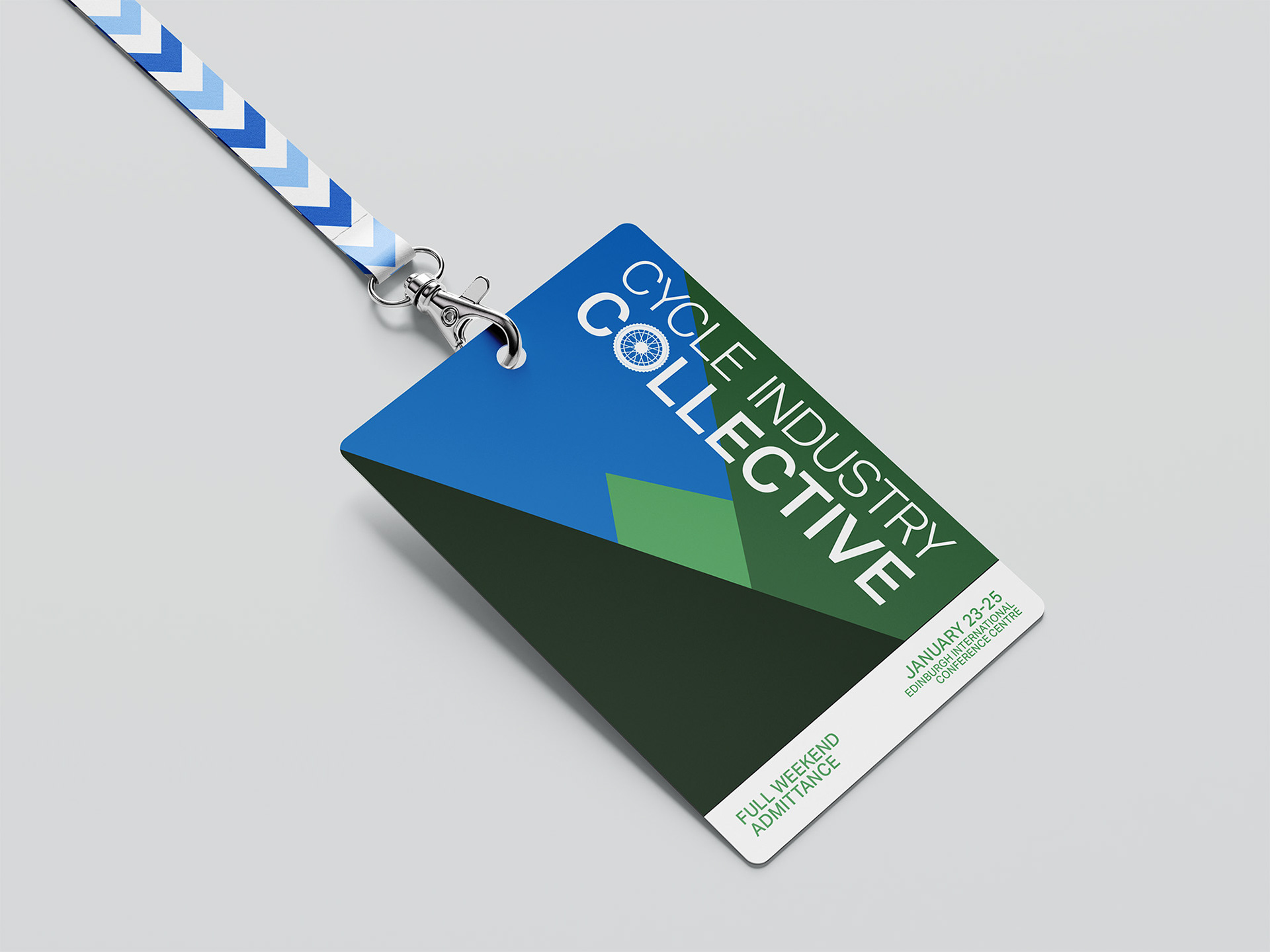
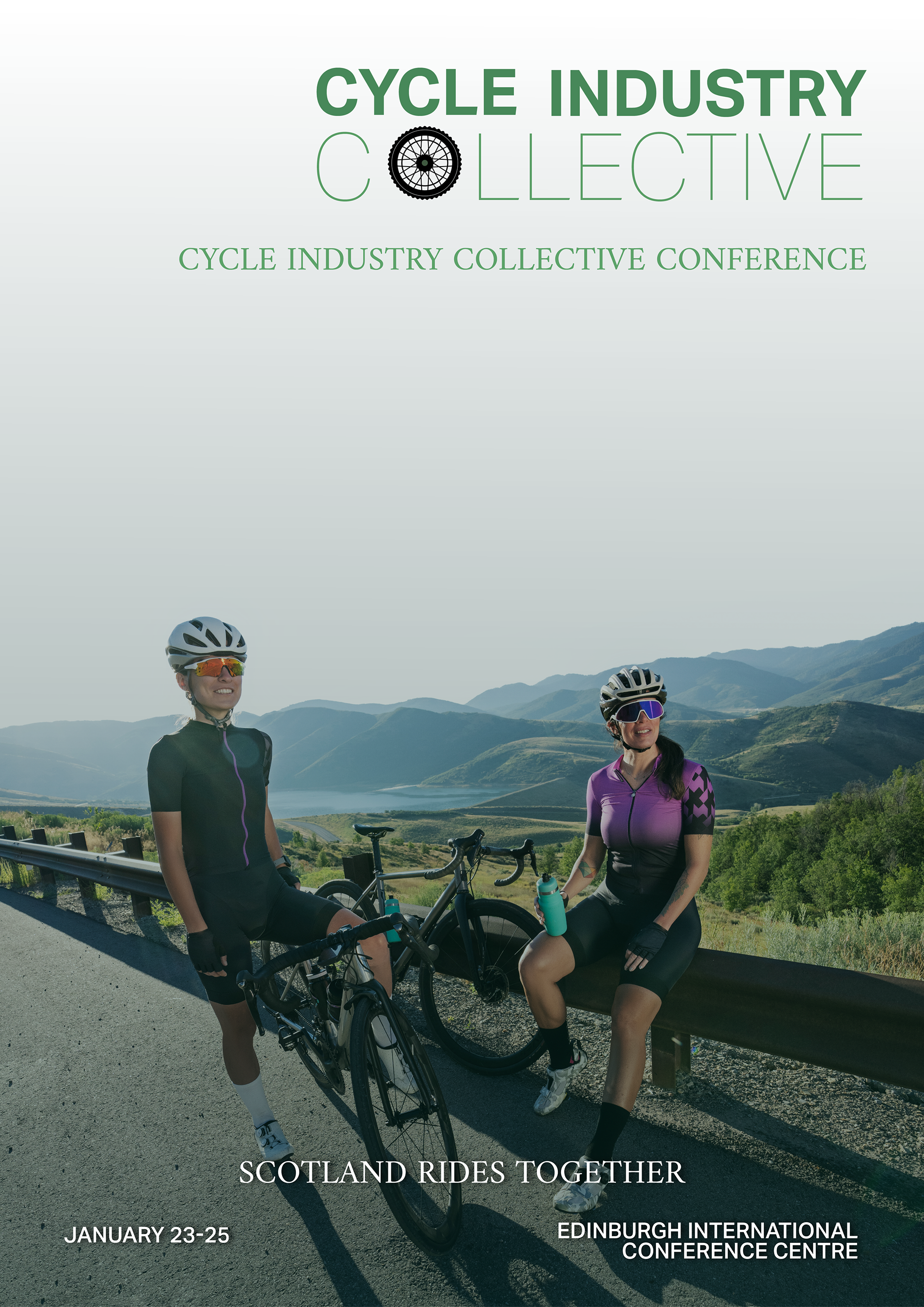
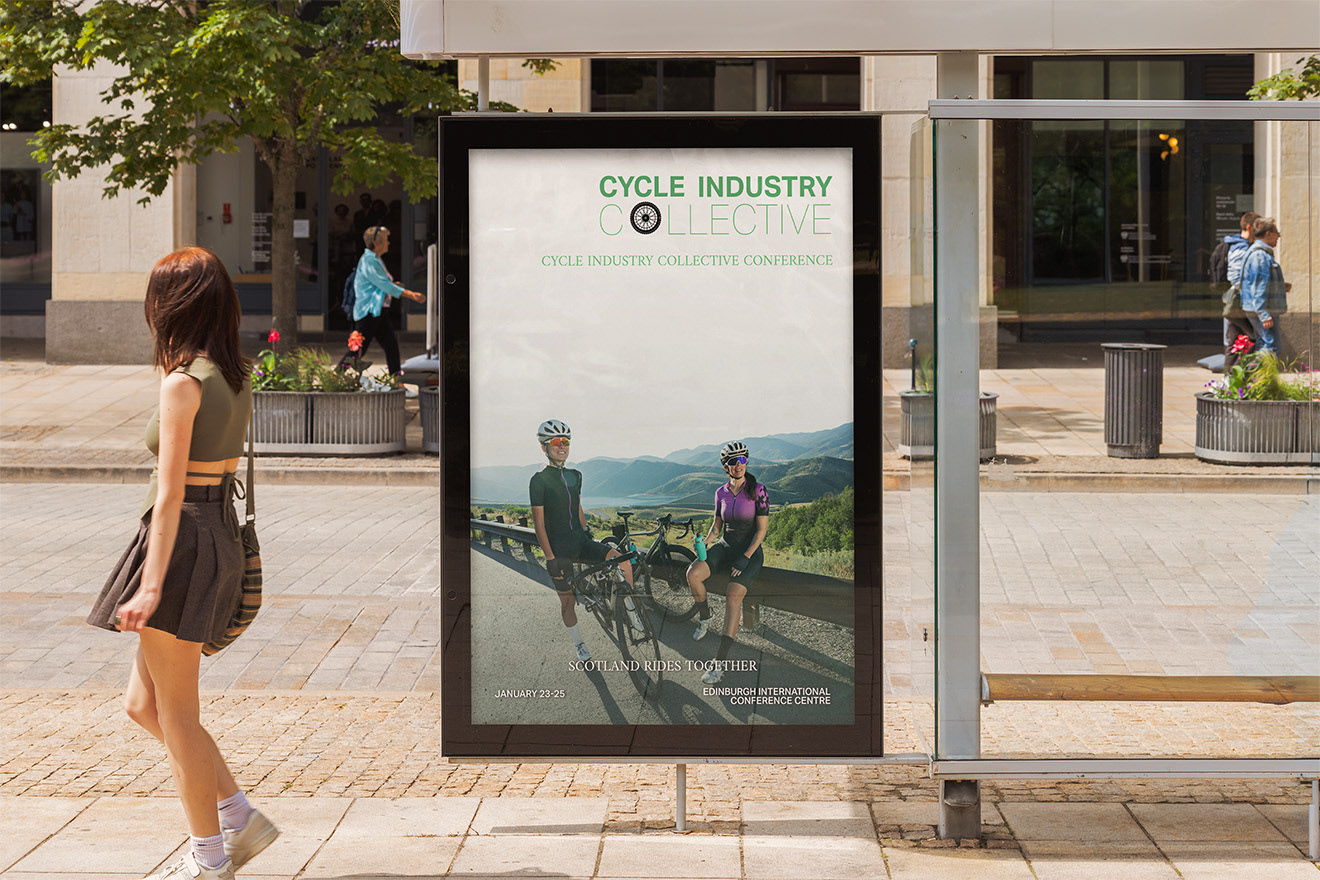
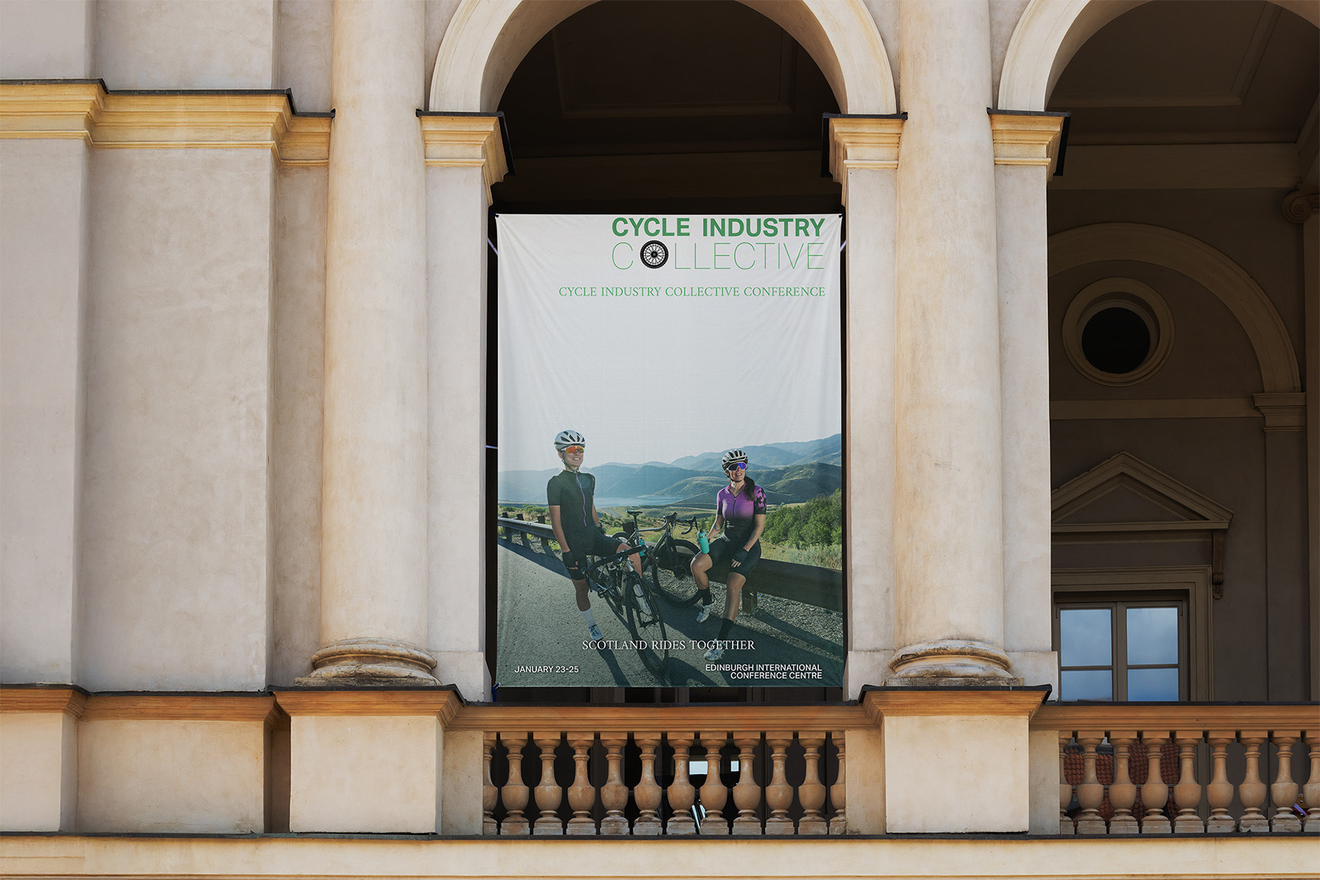
This project involved creating a complete visual identity for a cycling event, designed to feel energetic, modern, and suitable for use across both print and digital platforms. The focus was on building a clear and consistent look that could be easily applied to multiple event materials.
The challenge
The main challenge was to design an identity that captured the sense of movement and excitement associated with cycling, while still remaining clear and professional. The branding needed to work at different sizes and across different formats, without losing impact or readability.
The solution
A bold and cohesive visual system was developed using strong typography, a defined colour palette, and graphic elements inspired by motion and speed. The designs were created as scalable vector assets to ensure consistency and flexibility across all event materials.
The outcome
The final result is a clean, adaptable event identity that communicates energy and professionalism. The project demonstrates an ability to create structured branding that works beyond a single design, showing consideration for real-world application and consistency.